搭建一个 UI 框架
JeremyJone ... 2025-3-15 大约 10 分钟
# 搭建一个 UI 框架
搭建一个 UI 框架,是学习的终极解决方案,既可以学习到所有基础内容,又可以接触到从搭建、开发、打包的一系列全流程。
从中可以学到:
- 合理搭建项目结构
- 打包工具的使用
- 编译工具的使用
- 类型声明过程
# 项目构思
首先,我们要明确目标。我们创建的框架项目需要有以下内容:
- 类型声明,所以需要 TypeScript
- 与时俱进的内容,所以使用 vue3
- 高效的开发流程,所以使用 vite
- monorepo 环境管理是必须的,所以需要 pnpm
基于上,我们即将用到如下主体技术:
基础构建
- Vue
- TypeScript
- scss
- pnpm
- vite
打包
- vite
- gulp
# 搭建项目
确保系统已安装 pnpm,然后运行:
pnpm create vite ui-packages --template vue-ts
1
此时,我们就得到了基础项目内容。
# 修改项目结构
# 1、移动当前内容
- 首先,修改
src文件夹为examples。 - 接着把
public文件夹 和index.html都移动到examples下。 - 然后修改
index.html中的src路径,对应当前正确路径即可。
# 2、新增结构
- 在项目根目录下,新建
packages和scripts文件夹。 - 在
packages目录下,创建:components文件夹,用于存放组件源代码fonts文件夹,存放字体、图标等资源文件themes文件夹,存放公共样式utils文件夹,存放公共方法等
# 3、新增文件
- 在根目录下,创建
pnpm-workspace.yaml文件,并填入如下内容:packages: - "packages/**" - "examples"1
2
3它实现了一个
monorepo环境(指单仓库多项目,需要一个 packages 文件夹,里面还包含多个子包) - 在根目录下,创建
.npmrc文件,并填入如下内容:shamefully-hoist = true;1它确保使用
pnpm安装依赖时,可以将所有依赖扁平化,确保不会因为某些深层依赖出现不可预知的问题。 - 在
packages文件夹中新建vite-env.d.ts文件,并填入如下内容:/// <reference types="vite/client" /> declare module "*.vue" { import type { DefineComponent } from "vue"; const component: DefineComponent<{}, {}, any>; export default component; }1
2
3
4
5
6
7
# 4、修改文件内容
- 移动了文件内容,所以我们需要修改启动位置。修改
package.json中的启动参数:{ "scripts": { "dev": "cd examples && vite" } }1
2
3
4
5 - 在
tsconfig.json中添加如下内容:{ "emitDeclarationOnly": true, "declaration": true, "skipDefaultLibCheck": true, "declarationDir": "types" }1
2
3
4
5
6
最后,我们的项目结构基本就创建完毕,大体结构如下:
┌-- examples/
|     |-- assets/**
|     |-- components/**
|     |-- public/**
|     |-- App.vue
|     |-- index.html
|     |-- main.ts
|     |-- style.css
|     ╰-- vite-env.d.ts
|
|-- packages/
|     |-- components/**
|     |-- fonts/**
|     |-- themes/**
|     |-- utils/**
|     ╰-- vite-env.d.ts
|
|-- scripts/**
|-- .gitignore
|-- .npmrc
|-- package.json
|-- pnpm-workspace.yaml
|-- README.md
|-- tsconfig.json
|-- vite.config.ts
1
2
3
4
5
6
7
8
9
10
11
12
13
14
15
16
17
18
19
20
21
22
23
24
25
2
3
4
5
6
7
8
9
10
11
12
13
14
15
16
17
18
19
20
21
22
23
24
25
# 体验一下 monorepo 环境
首先我们在 packages/utils/ 下创建一个 index.ts 文件,并填入:
export const count = (a: number, b: number) => a + b;
1
同时在 packages/utils/ 下添加 package.json 文件:
{
  "name": "@ui-packages/utils",
  "version": "1.0.0",
  "description": "All utils are settled here",
  "main": "index.ts"
}
1
2
3
4
5
6
2
3
4
5
6
然后我们在 packages/components/ 下添加 index.ts 文件,添加如下内容:
import { count } from '@ui-packages/utils';

console.log(count(1, 2));
1
2
3
2
3
此时会找不到 @ui-packages/utils 包。没关系,我们安装一下:
pnpm install @ui-packages/utils -w // 如果不在根目录下执行,一定加上 -w
1
此时根目录下的 package.json 的依赖中会多一个 "@ui-packages/utils": "workspace:^1.0.0",而我们的 components/index.ts 文件中也不会再报找不到的问题了,说明它已经成功安装并引入了。
然后我们执行 components/index.ts 文件,它会正确打印 3。
如果无法执行,可以安装
npm install esno -g,然后通过esno index.ts来执行。
如果已经成功,则可以继续往下,我们将开始组件的创建。
# 开发一个 button 组件
我们所有组件都在 packages/components/ 下进行,这里作为 组件源码包 的根目录,先要创建一个 package.json 文件,并填入基础信息:
{
  "name": "@ui-packages/components",
  "version": "1.0.0",
  "description": "All components are settled here",
  "main": "index.ts",
  "module": "index.ts",
  "types": "components.d.ts"
}
1
2
3
4
5
6
7
8
2
3
4
5
6
7
8
然后,我们创建一个 button 文件夹,其结构如下:
|-- components/
|   ╰-- button/
|         |-- __tests__/**       // 测试用
|         |-- style/
|         |     ╰-- index.scss   // 样式文件
|         |-- index.vue          // 源码
|         |-- index.ts           // 组件入口文件
|         ╰-- prop.ts            // 参数
|-- components.d.ts              // 声明文件
|-- index.ts                     // 项目入口文件
|-- package.json                 // 包文件
╰-- vite-env.d.ts                // vite 环境依赖文件
1
2
3
4
5
6
7
8
9
10
11
12
2
3
4
5
6
7
8
9
10
11
12
后续所有组件也都按照这样的结构操作,方便打包。
# 声明参数
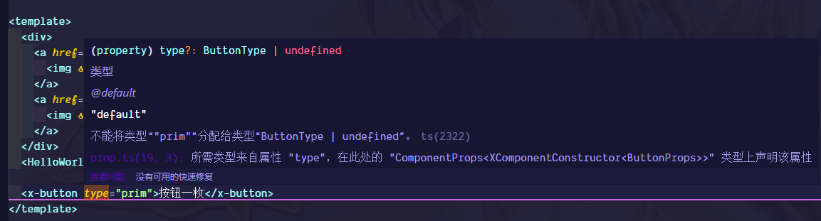
在 props.ts 文件中,我们需要声明按钮的参数。这里我们只做演示,所以仅仅声明:
- 类型
- 大小
其他内容不属于这里的讨论范围。
import { ExtractPropTypes, PropType } from "vue";

export type ButtonType =
  | "default"
  | "primary"
  | "secondary"
  | "success"
  | "warning"
  | "danger"
  | "info";

export type ButtonSize = "mini" | "small" | "normal" | "large" | "big";

export const props = {
  /**
   * 类型
   * @default "default"
   */
  type: {
    type: String as PropType<ButtonType>
  },

  /**
   * 按钮大小
   * @default "normal"
   */
  size: {
    type: String as PropType<ButtonSize>
  }
}

export type ButtonProps = ExtractPropTypes<typeof props>;
1
2
3
4
5
6
7
8
9
10
11
12
13
14
15
16
17
18
19
20
21
22
23
24
25
26
27
28
29
30
31
32
2
3
4
5
6
7
8
9
10
11
12
13
14
15
16
17
18
19
20
21
22
23
24
25
26
27
28
29
30
31
32
# 创建组件
接着创建按钮组件:
<template>
  <button :class="['x-button', `x-button--${cptSize}`, `x-button--${cptType}`]">
    <slot />
  </button>
</template>

<script lang="ts">
import "./style/index.scss";
import { defineComponent } from "vue";
import { props } from "./prop";

export default defineComponent({
  name: "x-button",
  props,

  computed: {
    cptSize() {
      return this.size || "normal";
    },

    cptType() {
      return this.type || "default";
    }
  }
});
</script>
1
2
3
4
5
6
7
8
9
10
11
12
13
14
15
16
17
18
19
20
21
22
23
24
25
26
2
3
4
5
6
7
8
9
10
11
12
13
14
15
16
17
18
19
20
21
22
23
24
25
26
# 添加样式文件
# 定义通用样式
首先,我们需要在 themes 文件夹中添加一个包,里面需要定义一些通用样式文件。
在 themes 文件夹下创建 package.json 文件,并填入:
{
    "name": "@ui-packages/themes",
    "version": "1.0.0",
    "description": "All themes are settled here",
    "main": "index.scss"
}
1
2
3
4
5
6
2
3
4
5
6
我们在按钮中定义了类型和大小,为了更好的通用性,我们应该在通用方法里定义这些基础变量。所以,在 themes 下创建 var.scss 文件:
// ***** 定义所有基础变量 ***** //

// 所有颜色配置
$primary-color: #eca710 !default;
$secondary-color: #368ee0 !default;
$success-color: #29b84d !default;
$warning-color: #c15d1f !default;
$danger-color: #e4131e !default;
$info-color: #a035ec !default;

$text-color: #212121 !default;

$colors: (
        "primary": $primary-color,
        "secondary": $secondary-color,
        "success": $success-color,
        "warning": $warning-color,
        "danger": $danger-color,
        "info": $info-color,
        "text": $text-color
) !default;

// 所有大小配置
$size-base: 16px !default;
$size-none: 0 !default;
$size-xs: $size-base * 0.25 !default;
$size-sm: $size-base * 0.5 !default;
$size-md: $size-base * 1 !default;
$size-lg: $size-base * 1.5 !default;
$size-xl: $size-base * 3 !default;

$sizes: (
        "none": $size-none,
        "xs": $size-xs,
        "sm": $size-sm,
        "md": $size-md,
        "lg": $size-lg,
        "xl": $size-xl
) !default;

$font-size: 14px;
1
2
3
4
5
6
7
8
9
10
11
12
13
14
15
16
17
18
19
20
21
22
23
24
25
26
27
28
29
30
31
32
33
34
35
36
37
38
39
40
41
2
3
4
5
6
7
8
9
10
11
12
13
14
15
16
17
18
19
20
21
22
23
24
25
26
27
28
29
30
31
32
33
34
35
36
37
38
39
40
41
另外,我们希望将颜色可以更加灵活的进行配置,可以考虑添加到 :root 下,所以新建一个 colors.scss
文件,并添加如下内容:
@import "./vars.scss";

:root {
  @each $key, $color in $colors {
    --x-color-#{$key}: #{$color};
  }
}
1
2
3
4
5
6
7
2
3
4
5
6
7
然后创建 index.scss 并引入该文件:
@import "./var.scss";
@import "./colors.scss";
1
2
2
# 定义按钮的样式
定义好了基础样式,我们需要引入它们:
pnpm install @ui-packages/themes -w
1
在组件中,我们定义了 x-button,以及大小和类型的样式,我们需要在样式文件中实现它:
@use "sass:math";
@import "@ui-packages/themes/index.scss";

.x-button {
  border: 0;
  border-radius: 4px;
  transition: all 0.2s;

  &:hover {
    filter: brightness(1.2);
  }

  &:active {
    filter: brightness(0.8);
    border: 0px;
    outline: 0px;
  }

  &:focus {
    filter: brightness(1.1);
    border: 0px;
    outline: 0px;
  }
}

.x-button--default {
  color: var(--x-color-text);
  background-color: lightgrey;
}

@each $key, $color in $colors {
  .x-button--#{$key} {
    color: var(--x-color-text);
    background-color: #{$color};
  }
}

$size-xs: $size-base * 0.25 !default;
$size-sm: $size-base * 0.5 !default;
$size-md: $size-base * 1 !default;
$size-lg: $size-base * 1.5 !default;
$size-xl: $size-base * 3 !default;

$buttonSizes: (
        "mini": $size-xs,
        "small": $size-sm,
        "normal": $size-md,
        "large": $size-lg,
        "big": $size-xl
) !default;

@each $key, $size in $buttonSizes {
  .x-button--#{$key} {
    padding: #{math.div($size, 2)} #{$size};
  }
}
1
2
3
4
5
6
7
8
9
10
11
12
13
14
15
16
17
18
19
20
21
22
23
24
25
26
27
28
29
30
31
32
33
34
35
36
37
38
39
40
41
42
43
44
45
46
47
48
49
50
51
52
53
54
55
56
2
3
4
5
6
7
8
9
10
11
12
13
14
15
16
17
18
19
20
21
22
23
24
25
26
27
28
29
30
31
32
33
34
35
36
37
38
39
40
41
42
43
44
45
46
47
48
49
50
51
52
53
54
55
56
上面的样式文件,定义了一个按钮的基础样式,同时配合类型和大小,定义了不同的属性。 这样,一个基本的按钮就制作完成了。
# 导出组件
我们在 button/index.ts 中添加导出方法。它需要支持单独导入,和整体导入,所以我们需要给 Button 组件添加 install 方法:
import type { App, DefineComponent } from "vue";

import { ButtonProps } from "./prop";
import Button from "./index.vue";

// 定义一个具有安装方法的类型
export type XComponentConstructor<T> = DefineComponent<T> & {
  install: (app: App) => void;
};

// 定义一个给组件添加安装方法的工具方法
export const withInstall = <T = {}>(comp: any) => {
  (comp as XComponentConstructor<T>).install = app => {
    app.component(comp.name, comp);
  };

  return comp as XComponentConstructor<T>;
};

// 给 Button 组件添加安装方法,并导出这个组件
const XButton = withInstall<ButtonProps>(Button);

export default XButton;
1
2
3
4
5
6
7
8
9
10
11
12
13
14
15
16
17
18
19
20
21
22
23
2
3
4
5
6
7
8
9
10
11
12
13
14
15
16
17
18
19
20
21
22
23
接着,我们在 packages/index.ts 中导入 XButton 组件:
import { App, Plugin } from "vue";

import { default as XButton } from "./button/index";

// 生成的组件添加到集合中
const components: Record<string, Plugin> = {
  XButton
};

// 定义整体挂在方法,就是依次挂载所有组件
const install = (app: App, options?: Record<string, unknown>) => {
  for (const key of Object.keys(components)) {
    app.use(components[key], options);
  }
};

// 支持单个组件的分别加载
export { XButton };

// 整体加载使用
export default { install };
1
2
3
4
5
6
7
8
9
10
11
12
13
14
15
16
17
18
19
20
21
2
3
4
5
6
7
8
9
10
11
12
13
14
15
16
17
18
19
20
21
# 添加组件类型声明
最后,为了我们可以在使用中查看组件类型,我们需要在 components.d.ts 中添加:
import "@vue/runtime-core";

declare module "@vue/runtime-core" {
  export interface GlobalComponents {
    XButton: typeof import("./button/index")["default"];
  }
}
1
2
3
4
5
6
7
2
3
4
5
6
7
这样,我们在使用中,可以找到对应的组件类型。
# 测试按钮效果
首先,还是安装组件库。如果已经安装,可以跳过:
pnpm install @ui-packages/components -w
1
接着,我们在 examples 的 main.ts 文件中添加刚才的组件。使用方式和其他组件库一样:
import XUI from "@ui-packages/components";

createApp(App).use(XUI).mount("#app");
1
2
3
2
3
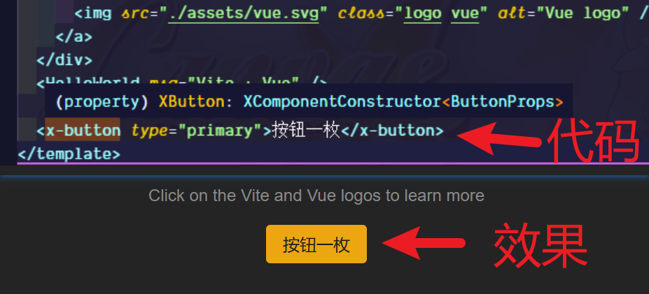
然后我们在 App.vue 中添加一个我们的按钮,它叫 XButton:
<x-button>按钮一枚</x-button>
1
此时,类型提示也可以正常显示,包括我们定义的属性,如图:
如果提示
@vitejs/plugin-vue关于 JSX 语法的错误,那你缺失了examples/vite.config.ts文件:import { defineConfig } from "vite"; import vue from "@vitejs/plugin-vue"; // https://vitejs.dev/config/ export default defineConfig({ plugins: [vue()] });1
2
3
4
5
6
7
# 调整工具方法
上面我们在导出按钮组件时,将导出方法写在了 index.ts 中。这样在后续写多个组件,是非常不方便的。我们需要把工具函数放到 utils 中去。
我们之前已经添加了 utils/index.ts 文件,现在将上面写的导出声明方法添加到这里:
import type { App, DefineComponent } from "vue";

export type XComponentConstructor<T> = DefineComponent<T> & {
  install: (app: App) => void;
};

export const withInstall = <T = {}>(comp: any) => {
  (comp as XComponentConstructor<T>).install = app => {
    app.component(comp.name, comp);
  };

  return comp as XComponentConstructor<T>;
};
1
2
3
4
5
6
7
8
9
10
11
12
13
2
3
4
5
6
7
8
9
10
11
12
13
然后,我们每个组件中的 index.ts 就不在需要,而是直接引入使用即可:
import { withInstall } from "@ui-packages/utils";
import { ButtonProps } from "./prop";
import Button from "./index.vue";

const XButton = withInstall<ButtonProps>(Button);

export default XButton;
1
2
3
4
5
6
7
2
3
4
5
6
7
这样,所有内容就在它应该在的地方了~
# 打包
# 打包组件文件
vite 配置了专门的库打包模式,我们可以通过简单配置就可以完成打包工作。
在 scripts/ 文件夹下创建一个 build.ts 文件,并添加如下内容:
import { defineConfig } from "vite";
import vue from "@vitejs/plugin-vue";

export default defineConfig({
  publicDir: false,
  plugins: [vue()],

  build: {
    target: "modules",                              // 打包模式
    minify: true,                                   // 是否启动压缩
    emptyOutDir: true,
    rollupOptions: {
      external: ["vue"],                            // 要忽略的包
      output: [
        {
          globals: { vue: "Vue" },
          format: "es",                             // 打包格式
          entryFileNames: "[name].js",              // 打包后入口文件名。默认 xxx.es.js
          assetFileNames: "index.css",              // 打包后资源文件名
          preserveModules: true,                    // 是否对应目录
          dir: "es"                                 // 打包后的目录
        },
        {
          globals: { vue: "Vue" },
          format: "cjs",
          entryFileNames: "[name].js",
          preserveModules: true,
          dir: "lib"
        }
      ]
    },
    lib: {
      entry: "./packages/components/index.ts",       // 入口文件
      formats: ["es", "cjs"]                         // 打包格式,可配置多个,与 output 对应即可
    }
  }
});
1
2
3
4
5
6
7
8
9
10
11
12
13
14
15
16
17
18
19
20
21
22
23
24
25
26
27
28
29
30
31
32
33
34
35
36
37
2
3
4
5
6
7
8
9
10
11
12
13
14
15
16
17
18
19
20
21
22
23
24
25
26
27
28
29
30
31
32
33
34
35
36
37
接着修改根目录下的 package.json 打包命令:
vite build --config ./scripts/build.ts
1
它会调用该配置文件进行打包,结果会保存到根目录下。
# 打包声明文件
我们使用 vite 创建的项目,已经帮我们安装好了 vue-tsc,所以直接使用即可。稍微修改打包命令:
vue-tsc && tsc -d
1
此时可以得到一个 types 文件夹,里面包含了所有组件声明文件。但是它并不会打包 components.d.ts 文件。我们需要手动处理一下。
我们需要在 scripts/ 中添加 build.type.js,并填入:
import fs from "fs";

const build = () => {
  fs.copyFileSync(
    "./packages/components/components.d.ts",
    "./types/components.d.ts"
  );
  fs.appendFileSync("./types/index.d.ts", `import "./components.d";`);
};

build();
1
2
3
4
5
6
7
8
9
10
11
2
3
4
5
6
7
8
9
10
11
并且修改命令:
vue-tsc && tsc -d && node ./scripts/build.type.js
1
这样我们就打包好了文件。最后导出文件入口即可。添加如下内容到根目录下的 package.json:
{
  "files": [
    "es",
    "lib",
    "types"
  ],
  "types": "types/index.d.ts",
  "main": "lib/components/index.js",
  "style": "es/index.css",
  "module": "es/components/index.js",
  "exports": {
    ".": {
      "types": "./types/index.d.ts",
      "import": "./es/components/index.js",
      "require": "./lib/components/index.js"
    },
    "./styles/index.css": {
      "import": "./es/index.css",
      "require": "./es/index.css"
    }
  }
}
1
2
3
4
5
6
7
8
9
10
11
12
13
14
15
16
17
18
19
20
21
22
2
3
4
5
6
7
8
9
10
11
12
13
14
15
16
17
18
19
20
21
22
使用时,直接引入包名,然后引入样式,就可以全局使用我们的组件了:
import XUI from "ui-packages";
import "ui-packages/styles/index.css";
1
2
2